Does generating leads from your website seem impossible? You are not alone. Every single day, a business loses an audience’s potential – 97% of website visitors do not take action. Your competitors have discovered ways of seizing such visitors, but you have left and still have many possibilities evolving. Annoying, isn’t it?
The best part? There is no need to throw away the old model and start anew. In the following article, we will present 18 proven design features that can easily convert any web page into a lead generation machine and, as a result – turn more website visitors into clients.
User Experience Excellence
Lack of creativity constraints when coming up with the website; make it a full-blow functionality that can turn visitors into paying customers. The interaction design will effectively lead the users on a journey from the first click to the very last action. Consider easy use and orientation of the page, fast speed of loading, and the presence of a clear call for action in the most suitable but unobtrusive manner. Remember that every extra second of delay can reduce the chances of conversion by 7%; hence, quick and efficient working is paramount.
Dropbox is an advocate of no-cost solutions, allowing users to register in no more than three stages and with a page’s download speed of fewer than two seconds. The backbone of their system is built so that there is progressive loading; that is, the pertinent content is loaded for the availability of users before the rest of the content is fully loaded. Slack also subscribes to that principle whereby users are made to appreciate the service very fast: from the moment a new user lands on the homepage, she is able to create a workspace and invite her team members within 30 seconds.
Strategic Call-to-Action Placement
Your calls to action (CTAs) are more than mere buttons; they are the engine that drives the conversion. Place them in most likely action-taking spots, such as after resolving a pain, when a decision is being made, and where the user’s eyes are focused. Use the kind of text that encourages an immediate response from the customer, like “Start Your Free Marketing Audit” as opposed to the rather plain and boring “Click Here.”
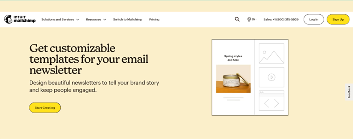
Mailchimp incorporates context-sensitive CTAs quite well throughout the entire website. For example, the ‘Sign Up Free’ button is transformation-friendly and turns into ‘Start Designing’ when a user is trying to retrieve a template gallery. There is a need to include the ‘Launch Campaign’ option in the email section. In Asana, the Patt Floating CTA has a feature that allows the ‘Try for free’ option to automatically remain visible as ‘Get started’ for the scrolling users eager to learn the product features.
Conversion-Optimised Landing Pages
In order to increase the efficiency of a landing page, one should make the entire page around one main objective. All other aspects that do not directly help that aim should be removed, for instance, navigation bars or other less important calls to action. As a result, visitors can only be guided by coherent and catchy titles, images, and text that concentrate on the particular needs and issues of the visitors that are being addressed. Every aspect should aim to ensure that visitors undertake a certain action.
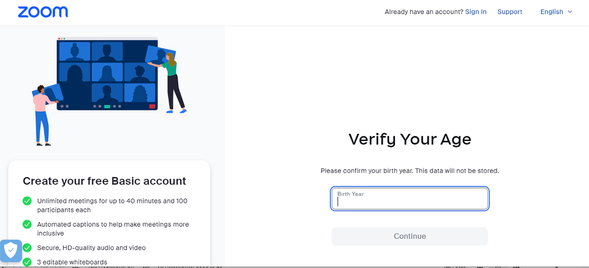
The pages for webinars that Zoom offers are simple and cut all the fluff, offering just the essentials, which include the title of the webinar, the speakers’ bio, key points of the webinar, and a registration form. For every case presented, Monday.com has its landing page providing the templates and the advantages and has only one step for users to perform.
Related read: Importance of User Experience in Web Design
Smart Form Design Strategy
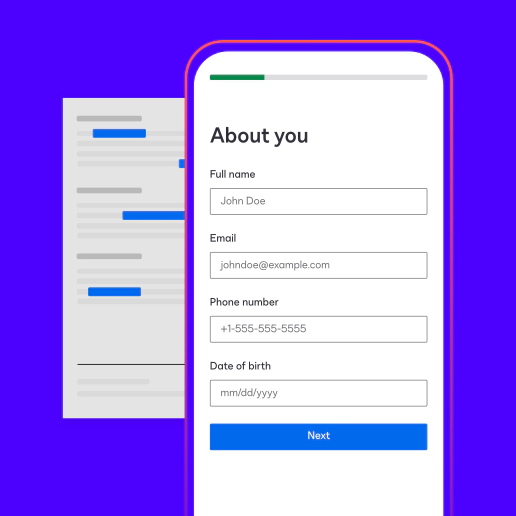
Forms are effective in obtaining lead information; thus, they ought to be used strategically. It is crucial to meet the information requirements while still ensuring the user’s active participation. Use only critical fields at first, progressive profiling for other details, and mobile optimising. A well-designed form can increase submission rates by as much as 25%.
DocuSign breaks down the filling of its forms into three processes; the first step only requires the email and the number of employees, and then further information is requested progressively. Zendesk removes this step, as it auto-populates the organisation’s information when the corporate email is provided, which cuts the form-filling time.
Value-Driven Lead Magnets
Create attractive offers that resolve the current problems of your target market. It does not matter if it is an industrial study, a blank form, or a software application; the focus of your proposal should be on your capacity and include some immediate return on investment. On the contrary, explore the pain points in detail and present solutions that will encourage them to engage with more of your content.
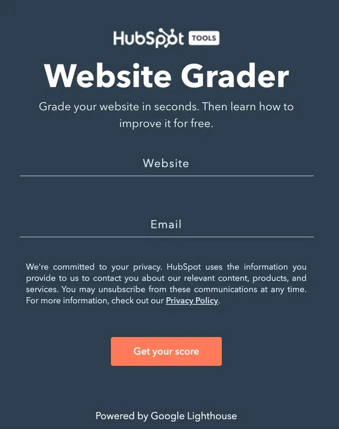
Hubspot’s Website Grader serves its purpose almost right away by analysing the websites of the visitors and offering a bunch of suggestions for the users’ contact details. SEMrush has keyword research template sets for various industries, making sure that their lead magnets address the core issues of their audience.
Strategic Visual Implementation
Don’t just insert the images; make the pictures serve the purpose of retelling the same story. Commission work based on original photographs, diagrams, and videos pertinent to the essence of the idea. Statistics indicate that strategies employing visual content can increase conversion rates by as much as 86%, but only in the right context. Here, attention shall be directed more toward the visuals explaining hard-to-understand concepts, showing product images, or creating emotional bonding.
Deep Audience Understanding
Understanding one’s potential customers is essential to success in any endeavour for which one pursues leads. One should definitely aim to develop such buyer personas based on concrete evidence rather than conjecture. Pay particular attention to user behaviour, ask for feedback, and revise your knowledge of what users find appealing. Such information must guide every design and content decision.
For instance, Grammarly keeps the home page content suited to a certain type of visitor – whether a student, professional, or business person, ensuring every kind has its use cases. Salesforce does landing pages for different industries and adds different case studies and solutions for them.
Lead Generation Forms
Conversion rates – that is, the proportion of users taking the desired action on your website – can vary depending on how forms are placed on your website. Master the art of identifying the spots on the website where the visitors are most likely to convert and also are likely to engage the most. Also, play around with different placements, including but not limited to above the fold, inside the content, and slide-in, and evaluate how each performs relative to the other offers.
Wistia smartly uses trial forms within the video player in order to generate leads where engagement with the product is highest. In the same way, Coursera is also successful in the collection of data by deploying contextual modal forms when users are attempting to access course content.
Related read: How Website Designing maximise viewer engagements?
Mobile-First Design Philosophy
Statistics show that over 60.4% of traffic on the internet can be traced to mobile devices, so responsive design is not an option but a requirement. Ensuring that the functionality of the entire site works flawlessly on any device – touch-friendly buttons, clear, legible text, and properly arranged fillable forms. This can translate into increased ecommerce conversion rates.
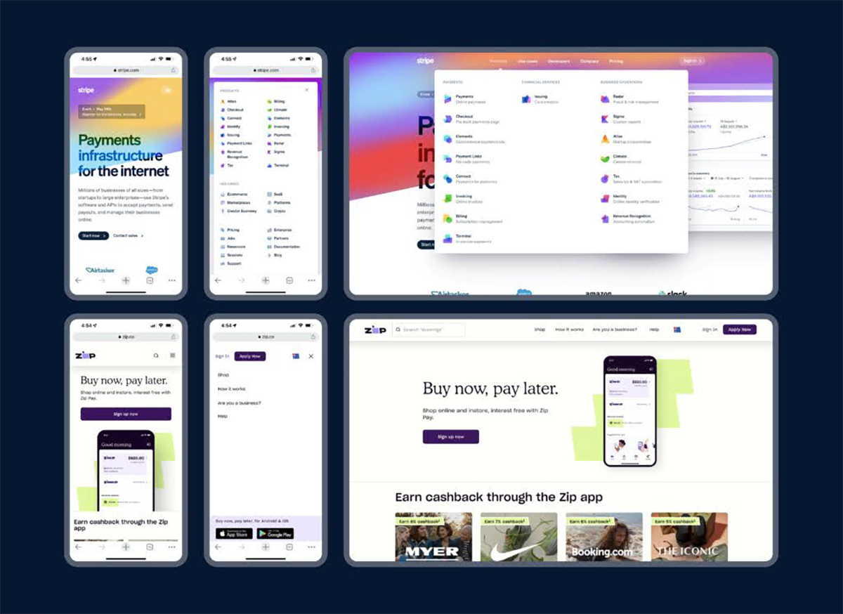
As a result, Stripe could revise its documentation and corresponding sample codes depending on the user’s device, with no hiccups while changing devices. Likewise, Square avoids using block grading styles of text, thereby incorporating touch-coupled buttons and folding sections instead.
Compelling Social Proof Integration
Show clients that you are ready and capable by producing proof of your accomplishments. Where relevant and possible, include things like customer testimonials, case studies, or reviews as evidence. Numbers up your results and use numbers to prove your Point. For example, ‘Join over 10,000 businesses that have increased their revenue through our solution by 30% is better than ‘Join us’ or similar expressions that are not so specific.
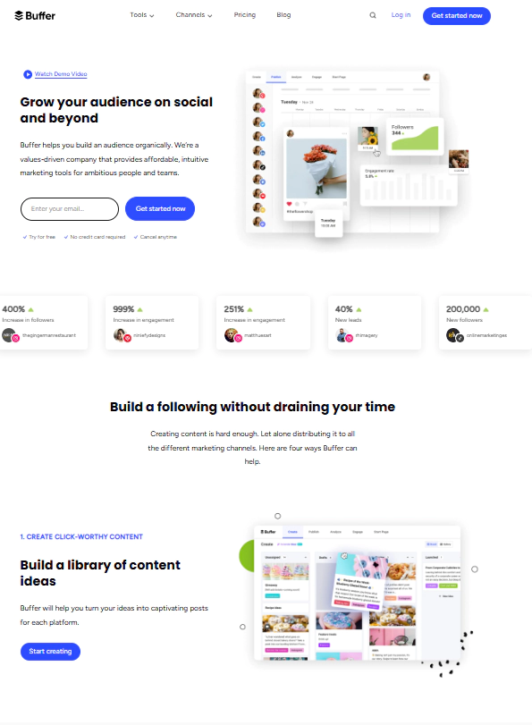
On the homepage of the Buffer, one can notice several interesting and engaging elements like the live user count and the scrolling X (formerly known as Twitter) feed, which displays all the compliments about the brand. Without scrolling down, the ambit of Calendly also shows the photos of the leading players within the sector and also tells the user that ‘10 million meetings were booked last month’.
Data-Driven Testing Approach
No assumptions should be made; everything should be substantiated. Establish a continuous A/B testing process to enhance the functioning of the entire site. Do not restrict yourself to testing the mere colour of buttons or the text of headlines; test each of the elements independently because it helps to understand what works and what does not. Even small changes can produce a major impact on the conversion rate.
Intuitive Navigation Structure
Forget about the chances of losing visitors to your site. Develop proper navigational designs to focus on the most important areas of your site content and its conversion points. Use the right words to hierarchically arrange content and design it in such a way that all pages are within three clicks of the home page.
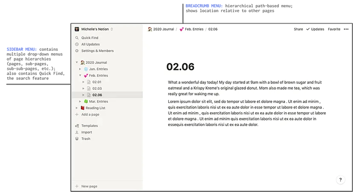
Notion uses an intuitive interface that has the main functional blocks presented in a nested structure, which are expansive but do not overcrowd with information; these functional blocks are not hard to hunt down. Users are able to search for a solution whenever they want because the huge menu of Microsoft 365 is structured in accordance with the user rather than the products themselves.
Proactive Live Chat Strategy
It is not enough to sit idly and wait for the visitors to present their curious inquiries. It is essential to be proactive and foster their desire to ask questions, as well as add smart chat triggers driven by the behavioural patterns on the site and particular pages at certain times. Offer help at strategic moments to minimise the chances of unwillingness to buy, as well as improve the trust regarding the presence of the support service by making it available.
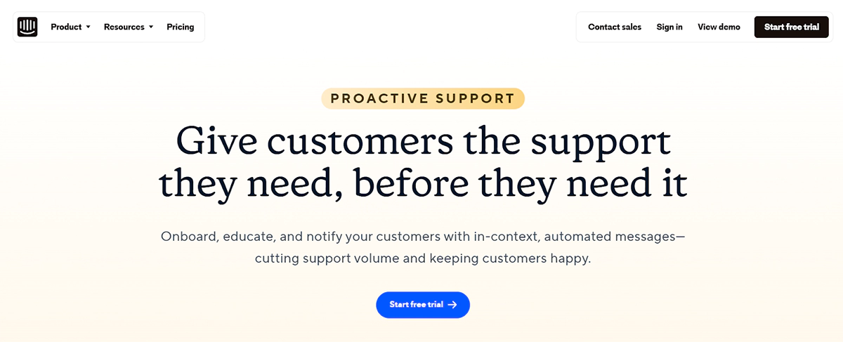
Intercom introduces a wait and chat function after a user has spent a set period of time on the pricing page. This is often done to discuss enterprise features or help the user decide on pricing plans. In the same way, Drift uses its chatbots to pre-quality leads before offering the leads to their sales agents.
Trust-Building Review System
Strategically place the reviews on the site in order to increase their usefulness. This will further require the correct placement of the potential clients’ responses on the website. Dealing with poor feedback and making the reaction to the feedback public will not evaluate the customers’ satisfaction but will only demonstrate the desire to do better and handle the challenges presented.
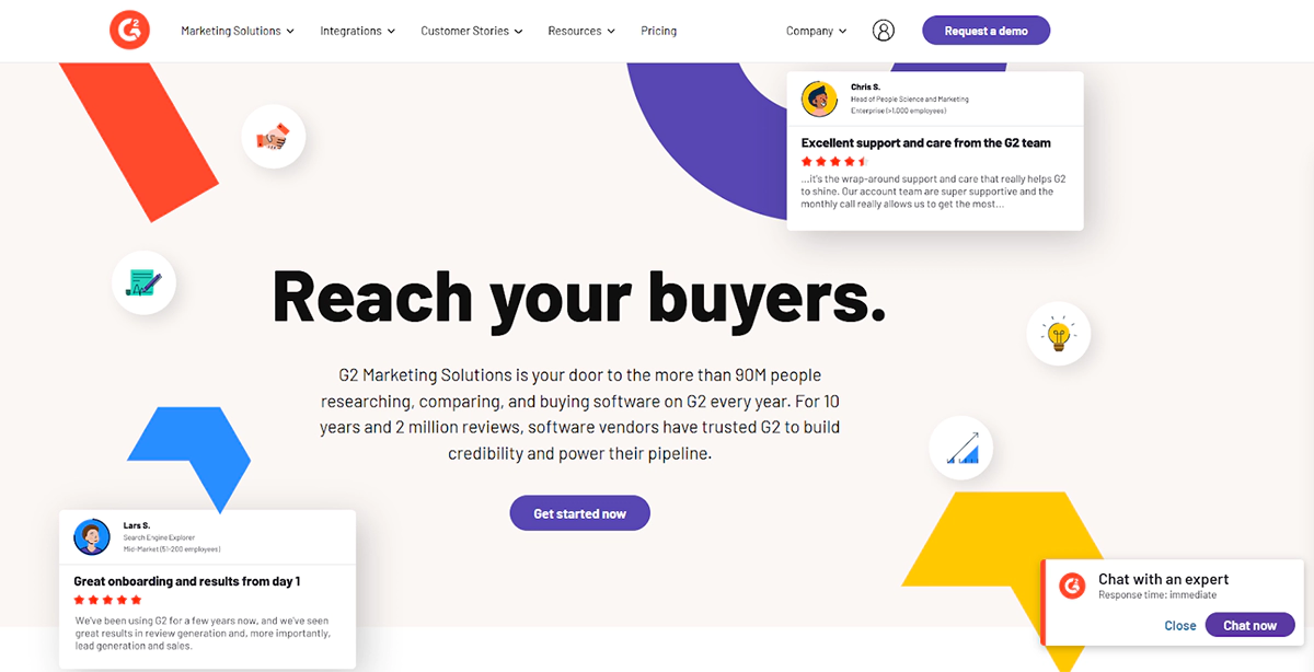
G2 is a review site where only verified users can rate companies across several categories according to business size or industry. To build trust, Trustpilot employs review score-rich snippets that appear on Google search results, even before users make it to the website.
Related read: How Minimalist Web Design Can Have a Large Impact on Customer Experience
Accessible Contact Information
Your focus should be to make it easy for potential clients to reach you. Add mobile click-to-call buttons at different parts of the site and ensure that there’s no inconsistent contact information. It is much easier to lose a prospect’s interest than it should be; even one extra click step to get to you is a chance wasted.
Performance-Optimised Infrastructure
Speed is not only a site’s goal from the technical standpoint, but it also plays a role, or perhaps even the most significant role, in deciding whether a visitor is going to complete an action or not. As a result, make sure that every single part of your site, from image compression to server response times, is performing optimally. It has been established that every one-second delay in the page load time reduces conversions by 7%; hence, it is important to optimise the generation speed of any leads.
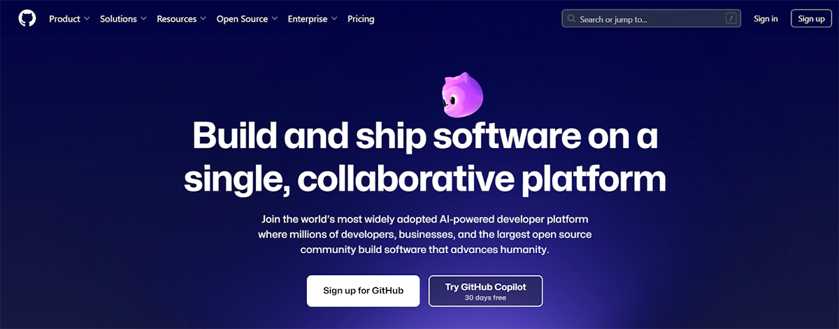
In the case of GitHub, under extreme levels of deep caching, the pages are also progressively loaded, even those that have repositories of the most advanced of pages. On par with WordPress.com, within its sites, images are optimised, and lazy loading is introduced, making it possible for even quite content-loaded sites to come up in almost real-time.
Gamified pop-up
Transform the ordinary alerts into something far more engaging. Use gamification elements such as spin the wheel, quizzes, progress-based reward systems, and other similar features to draw the client in instead of using the customary lead capture forms. The use of engaging features can increase conversion rates by as much as 40% compared to non-engaging static forms.
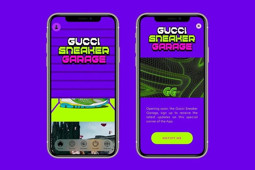
Gucci has opted into the NFTs and digital fashion, providing users with virtual items for services such as Roblox, Pokémon Go, and Zepeto. Through its Gucci Sneaker Garage app, users get to modify virtual sneakers, enabling the brand to reach out to a younger internet-driven audience. Other high-end fashion labels, inclusive of Louis Vuitton and Balenciaga, are also beginning to adopt the digital space, just like Gucci.
Conversion-Focused Content Structure
Frame the architecture so that, inevitably, the visitors are directed towards the conversion points. Provide a clear structure within which scannable components are included, and appropriate white spaces are added to ease the understanding of the content provided. Every page should be focused on a single element and move the users towards the next possible step, depending on the buying cycle.
Transform Your Lead Generation with Make My Website
Such design considerations are not easy to implement. They require designers’ skills and experience. Make My Website, one of the leading web solutions companies in Australia, concentrates on improving website performance as a way to enhance its functions.
Why Are We The Best Option For You?
- Increase in client acquisition.
- Have a sound understanding of the operation of the Australian economy.
- This is much more of a niche service owing to different verticals and target clients.
- Specification of design, function, and strategy at all times.
- And result-oriented metrics were executed to ensure the management of ongoing support services.
Are you fed up with your competitors, stealing leads that you should have? Contact Make My Website even now to have a complimentary consultation. This is the time to utilise the essence of design, which is the customer and, most importantly, the end customers who appreciate all the visitors to the page-turning into leads.

