Do you have fears that your site is not currently up to the required market standards and would, therefore, result in loss of traffic and sales? In the present, an outdated and poorly designed website will become a restriction quickly. The audience expects a high degree of modernity and interactivity, while search engines mainly reward new and appealing sites. How does your current website landscape stand out in all approximated projections for 2024? For additional information on today’s most exciting web designs, trends and tools, refer to these impressive 2024 website design trends. They stain out the remarkable web design thoughts that change the tide of one’s website from a useless piece of digital content to an income-generating machine. With these revolutionary design techniques, be on the right side of history and convert your customers into repeat customers.
Visual Aesthetics
1. Dark mode
Using dark mode isn’t just a trend that will soon phase out; it is changing the digital world. This eye-friendly option has come into the web’s utilisation, and it is sleek, classy, and functional – as every woman should be. Picture tapping a website at night, with the screen painted in black and a few colours peeping in. This is the beauty of dark mode.
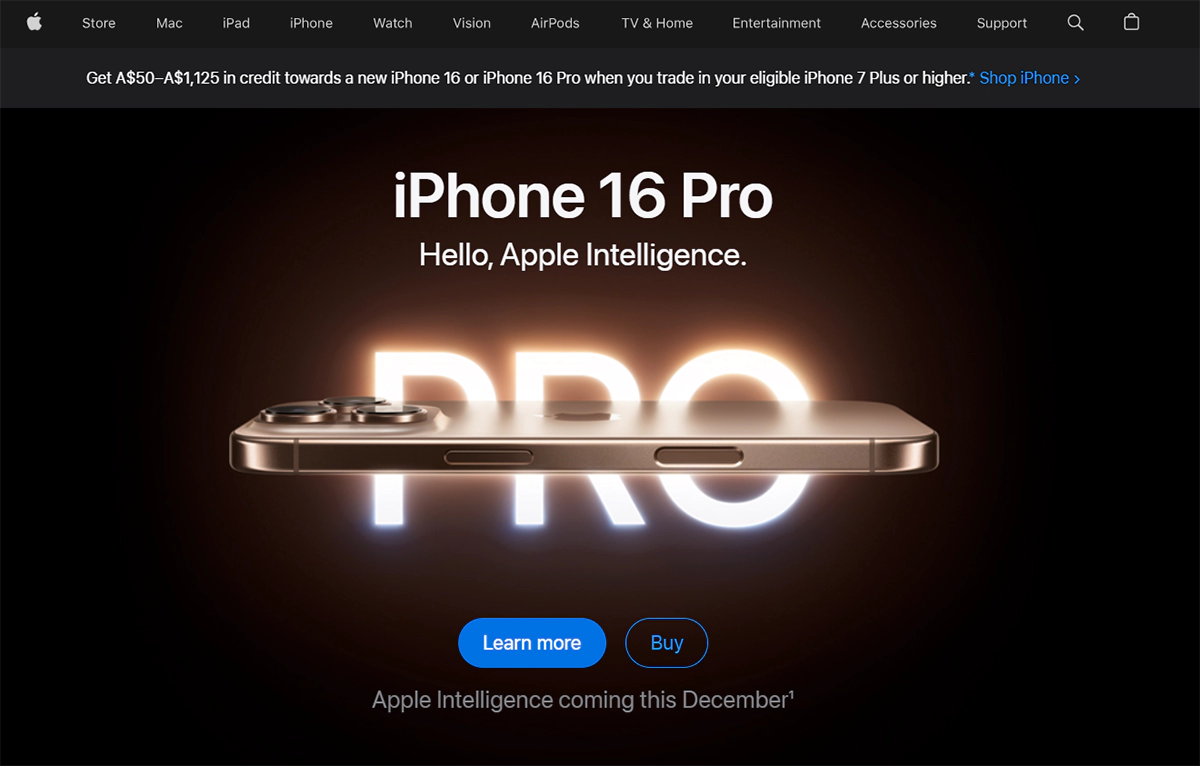
For instance: Apple’s website also offers a dark mode, which makes this site more accessible for the eyes and easy to read with low levels of light at night.
2. Gradients
Gradients have returned with full force, and they look stunning. They bring colour to backgrounds, text, and even images. You can imagine subtle colours like those seen during sunsets or at the ocean’s depths. Gradients enhance the creativity of websites.
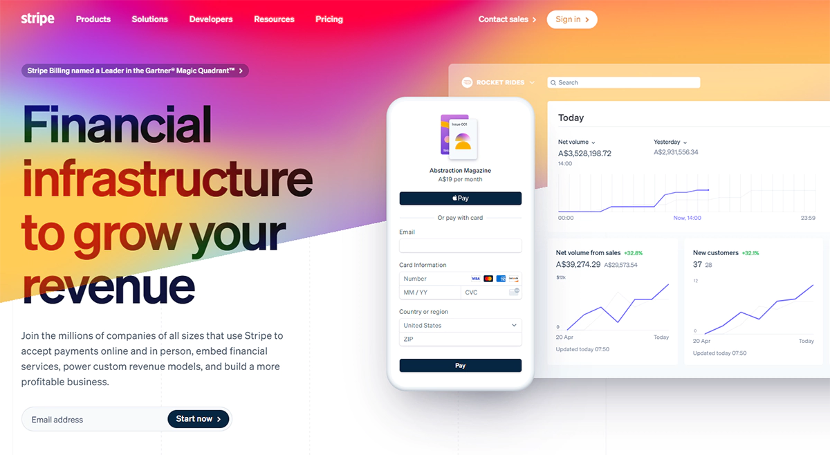
For instance: The gradients used on the complete blend of Strip’s site, including the background and illustrations, give it a modern, dynamic look.
3. Abstract and organic shapes
Web design approaches have recently evolved from rigid boxes to more flowing shapes. Think of elements as water or even living organisms like cells. These shapes provide a pathway to the contents.
For instance: Dropbox uses some abstract shapes and illustrations to make it look more animated, though still professional.
Interactive Elements
4. 3d and immersive elements
3D elements are adding a new dimension to web design—literally. They’re transforming flat screens into portals of immersive experiences. Imagine product showcases where you can almost reach out and touch the item, or backgrounds that seem to have depth beyond your monitor. It’s not just web design; it’s digital sorcery.
Example: Spotify’s Wrapped campaign (spotify.com/wrapped) uses 3D graphics to create an immersive, engaging year-in-review experience for users.
5. Micro interactions
Micro-interactions are the online versions of an ideal wink at an appropriate moment. They’re pretty helpful animation graphics that aid a website and make its usage conversational rather than choreographic. Think of buttons touching back when pressed, or icons animating when about to be scrolled. Such minute aspects have huge effects.
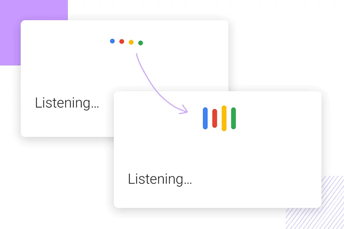
For example: When a user is searching on the Google search page, there are slight micro interactions present, such as the set of three animated dots that appear while the search is loading, offering the participant quick feedback.
6. Animations
Animations are transforming ordinary web pages into more advanced and interactive websites. Transition effects between non-scrolling headers that look like origami and content that moves as the user scrolls create a cinematic experience when surfing the net. It is not only a matter of browsing through a site but watching it in action and seeing how it performs.
Example: The homepage of Airbnb employs fundamental motions in their imagery to animate the illustrations – even the site’s scrolling content – thus enhancing the effectiveness of the users’ experience.
Typography Trends
7. Bold and experimental typography
Typographic design goes beyond comprehension; it has become a world of experiencing words among 2024 web design trends. Imagine big, eye-catching fonts; creatively crafted typefaces that convey a message without verbal communication; and unusual patterns, where even language is a form of artistry.
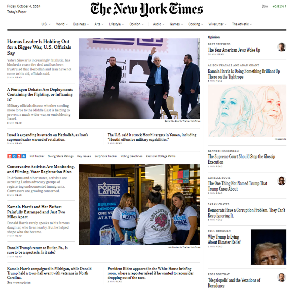
For instance: In the unique features of the New York Times newspapers, you will find precisely these, if not bolder and more experimental, types of headlines to attract readers’ attention.
8. Kinetic typography
Animated text, known as kinetic typography, is gaining traction. Letters and words move across the surface, enhancing the meaning and emotional impact.
For instance: The motion graphics made by the ‘Arrival’ movie website creatively integrated kinetic typography to replicate the foreign language within the motion picture. This made the alien experience feel natural to the visitors.
9. Large or oversized text
Oversized typography has recently found its place in design as part of functionality rather than as an element for reading only. Attention-grabbing, high readability-high level captions stretch the brains of designers.
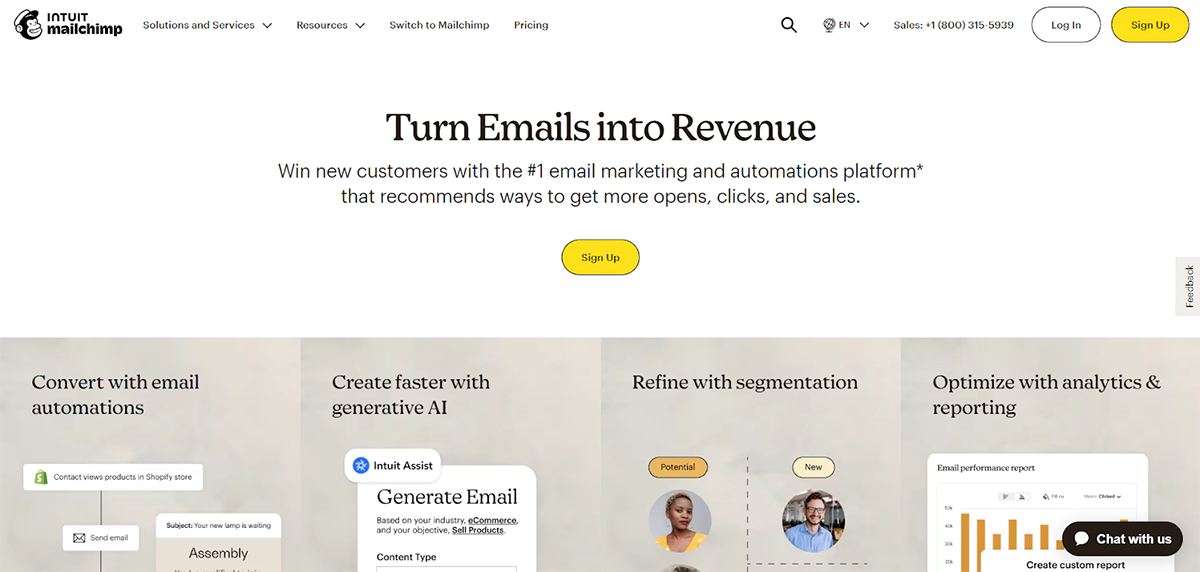
For example: Mailchimp’s homepage uses exaggerated bold fonts for headlines, giving an effective visual hierarchy where important messages come across instantly.
User-Centric Design
10. Minimalism
Minimalism always comes in as a welcome relief. It is about eliminating the inessentials and concentrating on what counts. Imagine a website where every element has a reason to be present, where space is not devoid of life but used with intent. This is more than just designing; this is arranging it in a digital form of Feng Shui.
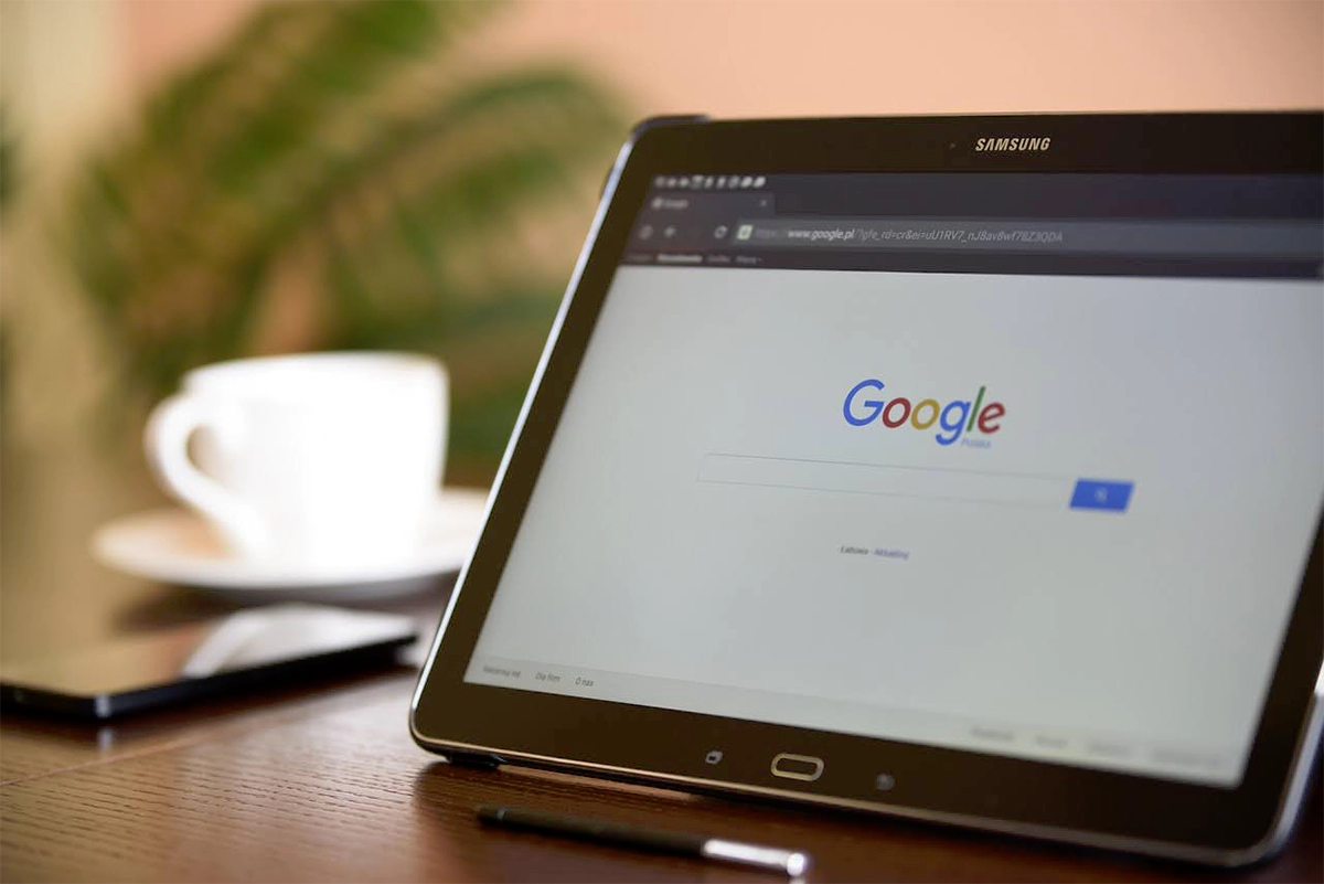
For instance: The page of Google’s entire space is used minimally effectively, concentrating only on its primary purpose – Search.
11. User experience
Regarding web design, everyone appreciates the interface – UI – but very few people understand the underlying network of rules, processes, and methods-the user experience – UX. It is what makes one site useable and another site enjoyable to use. Think of a website so simple to interact with that it seems to know your thoughts or pages load so quickly that you are sure you are not even using the internet.
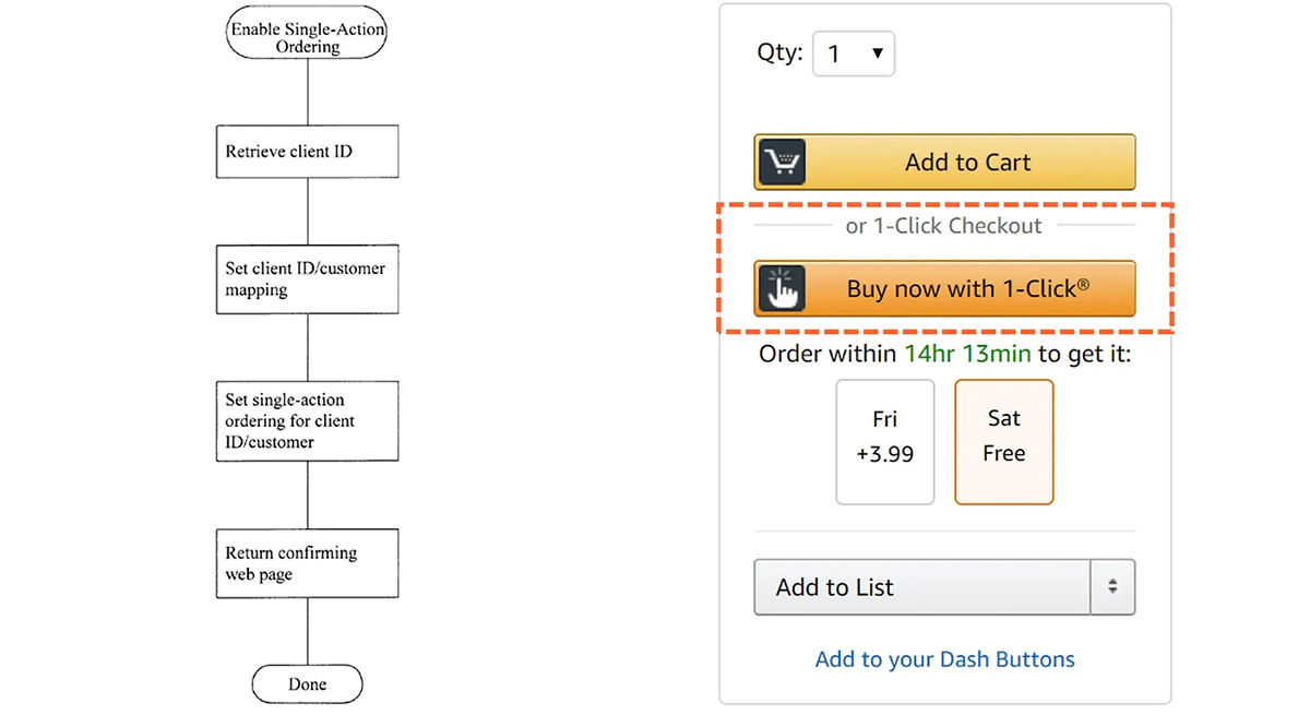
For instance: Amazon website continues working on its UX, incorporating features like one-click purchasing and user recommendations.
12. Horizontal scrolling
Even though vertical scrolling has become the standard, there are instances in which horizontal scrolling is gaining ground. It is mainly seen in pictures and portfolios of artists. It makes web browsing appear like a side-scrolling classic video game.
Example: The portfolio website of designer Tobias van Schneider, horizontal scrolling creatively to display all the designs he created.
Artistic Elements
13. Handmade illustrations
Handcrafted drawings come as a novelty. They add character and warmth to the pages of websites, making them less artificial. Imagine browsing a website and feeling like you are going through a well-illustrated picture book. That is the beauty of tailor-made illustrations.
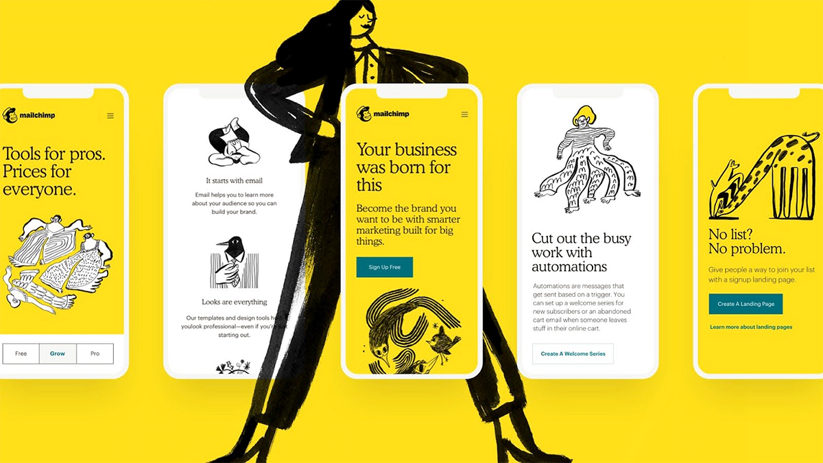
For instance: The playful, hand-drawn illustrations displayed on Mail Chimp’s websites add to their brand personality and help to simplify difficult ideas.
14. Combining images with graphic elements
Designers fuse images with graphic design to create captivating views. This incorporation enhances the images by adding layers, or can also focus on specific sections of a product or a message.
For example: Adidas product pages combine graphics with product images to demonstrate specific characteristics or achieve certain moods.
Interactive Experiences
15. Gamified design
Resources and even those who can create content are no longer enough, and hence, organisations continue to think of innovative ways of using the internet as a viable tool for marketing their resources and services. They have also found ways of helping users enjoy the site more by using game précises’ and where the visitors undertake specific tasks to receive a reward.
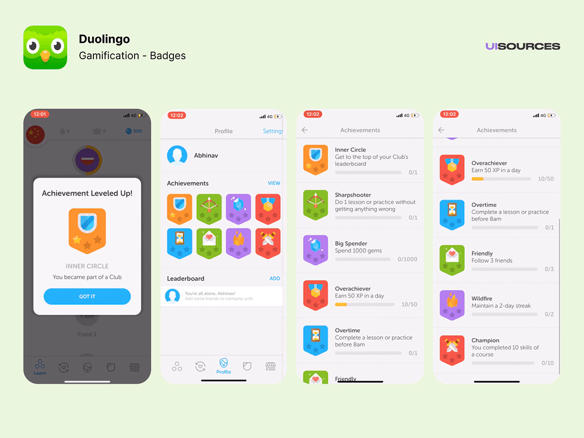
For instance: Duolingo uses a game-based approach to language learning by incorporating points, levels, and incentives into the educational system.
Bringing Website Design Trends of 2024 to Life with Make My Website
As we’ve seen in this guide, web design is an ever-changing area that offers threats and great opportunities for businesses seeking to establish a strong online presence. The shared recommended web design trends of 2024 will highly promote your website’s attractiveness, usability, and efficacy.
Yet, we appreciate how overwhelming it is to cope with these tendencies and execute them, especially if you are not a professional in web design. This is where Make My Website comes in. We have an experienced group of designers and developers who are aware of the trends in the market and are ready to implement your ideas.
At Make My Website, we’re not simply site developers; we are digital enhancers that revolve around your branding and business objectives. If you would like to redesign your current site or start with a new one, we can integrate these modern design principles effortlessly. Be it responsive designs, engaging interfaces, accessibility, or speed concerns, we ensure that your website looks on the looks side and works well within.
Do not let yourself be going at the back regarding the online world. Consider Make My Website a partner and allow us to develop an elegant piece of art, an ultra-modern website that will fully engage your target clients and push your business tremendously in 2024. Reach out to us now so we can begin the process of enabling you to enjoy a website that will be fit for the digital world.


