Building a website for the first time or getting it redone from scratch isn’t an easy task altogether, so don’t be so hard on yourself! Even if you get the best designers from all over the world to discuss components with you still predominantly you will have to sort things on your own. Getting your grip on the various aspects of your website and building them with much precision and versatility would need you to research and get yourself updated on various components of a website and the designs and concepts that match your vision. With hundreds of websites going online every week, you need to decide and know for yourself what your USP is going to be and what story does your brand want to narrate through your website’s text, pages and tools.
Of course, it takes a lot of planning and sorting to have a consensus on the various things you would like to add to your website. From the fonts, colour palette and themes to the main goals, purpose and message you want to put across with your website and its various elements. Apart from the looks, you would want to dive into looking at the key goals your website aims at achieving. For this, keep your audience and product in mind long with the keywords that would adorn your layout.
Mentioned below are 10 things to sort and keep in mind to sort when sitting down with your website designer to get the best website designed for your venture.
1. Establish your Main Goals
Underlining the main aims of your website is fundamentally the most important thing to do before beginning to build your website. However, it is not important to know all your goals in the beginning and you may come up with new ones as you are building your platform. Your website could have various goals, such as letting people know of your presence and help them get in touch or sell your products or to showcase your portfolio and artwork. Having a clear intention helps you build with intention and allows people to understand your venture better.
2. Know Your Target Audience
Knowing your audience does not simply mean knowing what your niche is, it also means understanding sites they regularly visit and their likes and dislikes. This will construct your websites’ theme, designs, content and building story and its overall capacity to speak to your audience. The networking efficacy of your website is directly proportional to your understanding of your audience and its ability to target and meet their requirements.
3. Research well (within and outside the industry)
Have an in-depth look at the websites in your industry and field. Take notes from their concepts and content to build a unique one for yourself. For this, you need to research in your field as well as outside to look for the designs and layouts you’re keen on creating. While browsing designs and layouts also keep in mind to understand what their appeal is built on and how they work as they do. You need to understand how to fulfil your audience’s requirements with the easiest means possible.
4. Select your Domain Name
Choosing a domain name is like naming your baby venture as your website is to a large extent the representation of your business on the face value. Pick a name that matches your business and its nature while being easy to remember. Keeping it short helps as then your clients can easily remember it and you can also place it in various spaces easily. Further, try to decide on a name keeping in mind the pros and cons as changing it later would bring in a lot of hassle. Your domain name should be crisp and having a rhyme helps people recall it faster.
5. Plan out your design & Layout
Designing your website takes a lot of research and more than anything brainstorming. You can create a catalogue of the designs that have appealed to you and the mood you’re aiming for. This way you can easily align every component thematically letting you pick the best parts from each project to incorporate into building your own unique vision. As for building your layout, sit down with a blank sheet and pencil to build what comes to your mind the first.
6. Fonts and Colour Palette
Your design or theme has two main components that speak on your behalf which are the fonts and the colour palette you choose for everything. They correspond and connect everything together to build a theme that you’re looking to create. Choose fonts that offer clarity against the background they’re put on, they should convey the tone of the message while including the overall design and build of the page within them. Colours have a huge impact on us and thus the selection of your colour palette would play a huge impact on the audience visiting your page. Various colours have a different effect on our minds and influence us differently. For example, paste colours offer a peaceful soothing vibe, sharp colours like navy blue, reds and black have a powerful and influential impact. You’ve got to choose as per your business’s unique needs.
7. Plan your pages and corresponding content
What is your website trying to convey and how well does it reach your visitors. What narrative are you trying to build and how many pages would you require for the same. You also need to keep them excited and engrossed by creating content that is thoughtful and at the same time enjoyable. Content doesn’t necessarily have to be long texts and lots of headlines, you can convey your thoughts in a crisp and compact manner while fully expressing yourself to reach your audiences. Keeping your content updated and concise help keep your audience involved.
8. Search Engine Optimization
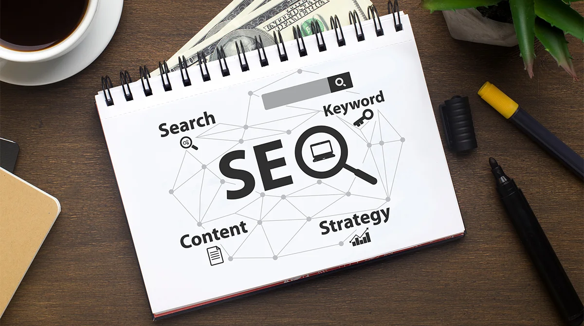
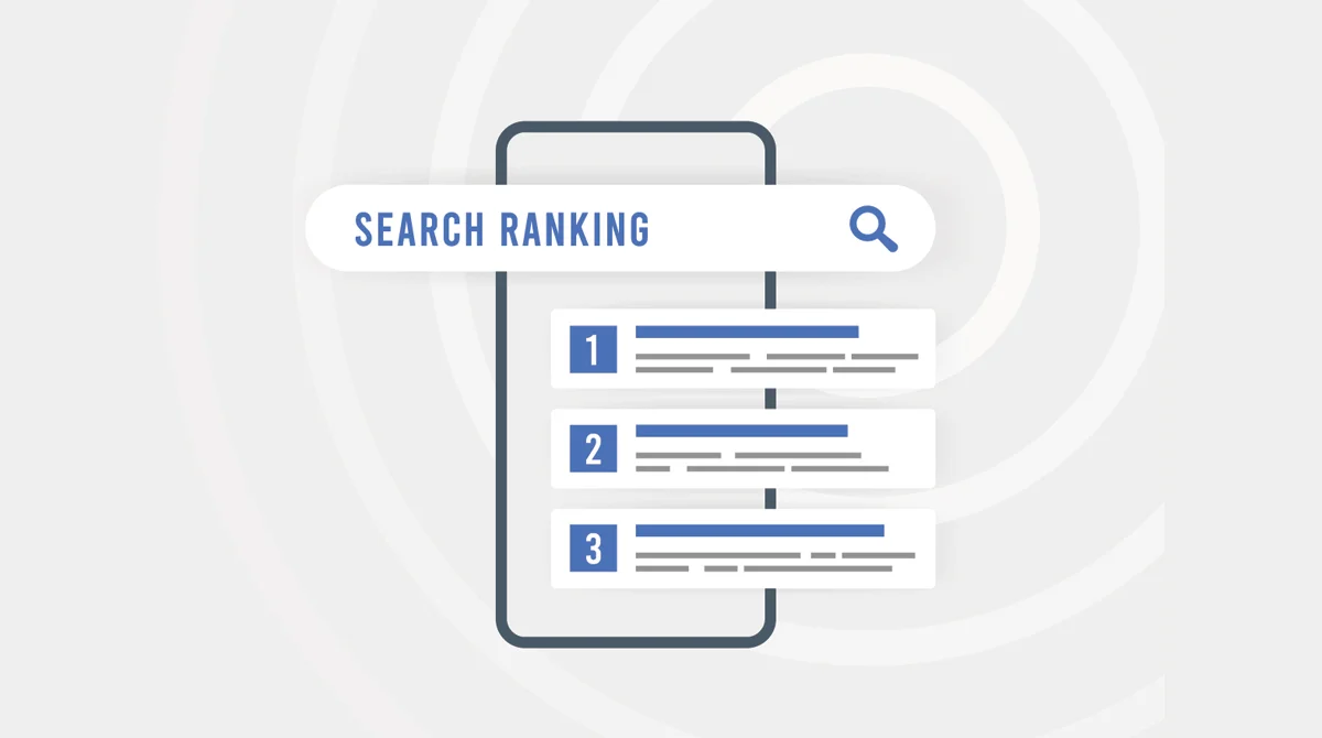
SEO plays a major role in helping the people you are looking for and the ones looking for you reach your page with much ease. This would require you to incorporate various keywords and phrases that match your website’s deliverables as well as your search engines’ known algorithms. SEO is an integral part of any website as no matter how amazing your content and how captivating your design is, if it doesn’t reach people, they wouldn’t know!
9. Choose a Logo
Your logo is how people are going to remember you as the mind thinks in images and not words which makes your logo even more important than your domain name. Choose a logo that captures your message fully and depicts it in the best capacity possible. Keep it simple as minimalism is the key these days and don’t forget to have it colour coded to help the theme prevail.
10. Finalise Graphics
Finally, keep some images shortlisted and handy to help your designer match them with your content and place them within the alignment. Don’t use extra-large images for impact and keep the quality superior to ensure that your graphics compliment the content and don’t overshadow it.


