Does your website fail to convert visitors into customers? Over 94% of first impressions are design-related, and a poorly designed website may be losing business opportunities for you every day. Bad web design has immediate and high costs. Visitors know how to leave bad sites in less than five seconds, mobile users will stay away from non-responsive designs, and poor security will destroy trust. Every mistake takes a bite out of your pocket. This guide presents the most fatal web design blunders and the realistic solutions to them. By answering these typical questions, you will also learn how to magically transform your website from anathema into an asset: a powerful business tool in attracting and converting customers.
Poor navigation
A successful site is built upon clear navigation. It frustrates users when they cannot find what they are looking for quickly, and they leave. A well-structured navigation system allows the users to browse through your site and find relevant information quickly.
Key issues to address:
- Confusing menu structures that don’t follow logical organisation
- Hidden navigation elements that users can’t quickly locate
- Too many menu items overwhelm users with choices
- Inconsistent navigation patterns across different pages
- Lack of breadcrumbs for complex site structures
Bad search
A practical search function is enough to make or break your website, especially when you have much content. The bigger the website, the more necessary it is to have a search function, and yet many are quite poor at it. Bad searches can lead to angry users and a loss of conversions. Smart searches should help the modern audience find what they want in a research-influenced, arms-reduced environment.
Essential search features to implement:
- Autocomplete suggestions to speed up the search process
- Relevant search results with proper ranking
- Filter and sort options for refined searching
- Clear error handling for zero-result searches
- Mobile-friendly search interface
Slow load times
Users are also expecting that the site will complete loading in 2 seconds or less. Every extra second cuts the conversion rates by 7%.
Impact of Load Times on Conversion Rates:
- 1 second delay = 7% reduction in conversions
- 3 second delay = 40% abandonment rate
- 5 second delay = 90% bounce rate probability
Quick fixes for better speed:
- Compress all images before uploading
- Enable browser caching
- Minimise HTTP requests
- Use a CDN for global audiences
Real example: For every improvement, however small – for every single second of page load decrease – Walmart reported a conversion increase of up to 2%.
Best practices for effective CTAs:
- Use contrasting colours that make buttons stand out
- Implement action-oriented text that creates urgency
- Position CTAs in logical locations within the user journey
- Maintain adequate white space around CTAs
- Test different variations to optimise performance
Unclear calls to action
Web accessibility imparts more than fulfilling an accessibility norm; it is about making your website usable by every visitor. Anything besides that would leave out potential users and may even expose an individual or company to legal risk.
Essential accessibility features:
- Proper heading hierarchy for screen readers
- Alternative text for all meaningful images
- Sufficient colour contrast for text readability
- Keyboard navigation support
- ARIA labels for complex interface elements
❌ What Not to Do:
- Generic button text (“Click Here”)
- Multiple competing CTAs
- Low contrast buttons
- Tiny click targets
✅ The CTA Formula:
- Strong Action Verb + Value Proposition + Urgency
- Example: “Get Your Free Trial Today”
→ Before: “Click Here”
→ After: “Get Your Free Trial Today”
Lack of accessibility
“The power of the Web is in its universality. Access by everyone regardless of disability is an essential aspect.”
– Tim Berners-Lee
Making your site practical is not only right, but also intelligent business. You may close out as much as 15 percent of the market by ignoring this access.
Must-have accessibility features:
- Alt text for all images
- Keyboard navigation support
- High contrast text (4.5:1 minimum ratio)
- Clear heading hierarchy
- Screen reader compatibility
Not Adhering to a Website Security-first Approach
Website security is not simply a supplementary feature; it is an essential element of web development. A security breach could ruin your name and cost you high amounts of money. Security is a feature to be incorporated from the beginning in the process of designing, as it safeguards in protection of both your website and its users.
Essential security measures:
- Install and regularly update SSL certificates
- Implement secure password policies and authentication
- Regular security audits and vulnerability assessments
- Secure form handling and data encryption
- Automated backup systems and disaster recovery plans
Not Following a Design Thinking Approach
It is very rare that online websites really adopt this methodology of design thinking process-oriented user-centred problem-solving to get resolved. It tells you that your site not only looks great but serves and solves all your users’ requirements and problems as well.
Key components of design thinking:
- Extensive user research and persona development
- Problem definition through user journey mapping
- Iterative prototyping and testing
- Continuous user feedback integration
- Data-driven design decisions
Not Prioritising Grid and Columns
A perfect grid system organisation provides structure and consistency to your website layout. A proper grid system, properly used would avoid misaligned and chaotic-looking elements in any design.
Grid implementation best practices:
- Use a consistent column structure across pages
- Maintain proper spacing between elements
- Implement responsive grid breakpoints
- Align elements precisely within the grid
- Balance negative space effectively
Not Using Trending Web Design Templates
While not every website needs to adopt the latest trends, being aware of modern designs is essential. It is because an outmoded design can reduce trust in users and appear unprofessional.
Current design considerations:
- Micro-interactions for better user engagement
- Dark mode compatibility
- Minimalist and clean layouts
- Custom illustrations and authentic imagery
- Advanced animation and transitions
Not Optimising The Website for Niche Keywords
One common problem with most websites is that they do not optimise their niche keywords suitably. Use proper keyword strategy for having visibility and reaching the target audience.
SEO optimisation strategies:
- Comprehensive keyword research and mapping
- Strategic placement of keywords in content
- Optimised meta titles and descriptions
- Proper heading tag hierarchy
- Internal linking structure optimisation
Using an Inadequate Colour Scheme
Colour choices can have a significant impact on user perception and brand recognition. An inappropriate colour palette would equally confuse users and dilute your brand identity.
Colour strategy essentials:
- Maintain consistent brand colours across all pages
- Ensure sufficient contrast for readability
- Consider colour psychology in your choices
- Test colour combinations for accessibility
- Use colour to guide the user’s attention
Non-Hierarchical Content
Poor hierarchy of content makes it very difficult to locate and understand information. A good-structured hierarchy leads the user through your content quickly.
Hierarchy implementation tips:
- Clear visual distinction between heading levels
- Consistent spacing between content sections
- Logical progression of information
- Strategic use of typography sizes
- Effective use of visual emphasis
Content-Overloaded Webpage
Excessive flooding with information serves as the gateway to cognitive overload and depression of user involvement. Smart arrangement and organisation of content view are essential in keeping the users.
Content management strategies:
- Implement progressive disclosure techniques
- Break complex information into digestible chunks
- Use expandable sections for detailed content
- Maintain focused messaging per page
- Include clear section divisions
Poorly Designed or UnOptimized Images
Under-optimisation of a website can lead to dire consequences in regard to site performance and usability. Appropriate image optimisation should be the consideration for speed, and it should also be aesthetically pleasing.
Image best practices:
- Choose appropriate image formats (JPG, PNG, WebP)
- Implement responsive image techniques
- Use appropriate compression methods
- Provide descriptive alt-text
- Maintain aspect ratios across devices
Ignoring Custom 404 Pages
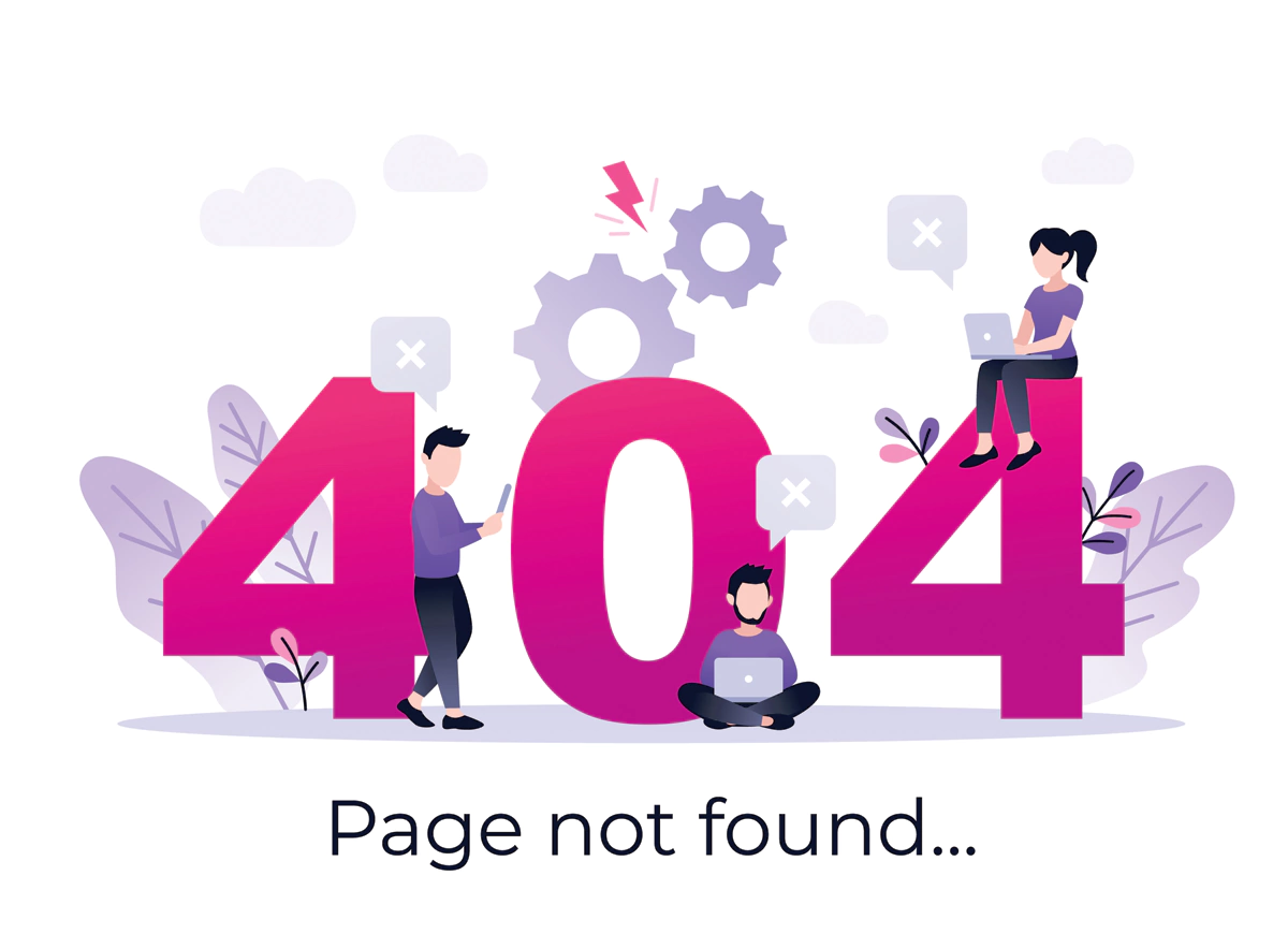
Generic error pages waste the chances to pull the user back to the site for useful content. An adequately designed 404 pages could convert potential frustration into a good experience.
404-page essentials:
- Brand-consistent design and messaging
- Clear navigation options
- Search functionality
- Engaging visuals or humour when appropriate
- Helpful suggestions for the next steps
- Think of 404 pages as conversion opportunities:
404-page elements:
└── Clear error message
└── Search bar
└── Popular links
└── Return to home
└── Contact support
Not Building Websites for Multiple Languages
An unduly international audience would restrict the reach of your website. To this, a proper multilingual approach would not only entail translation.
Multilingual considerations:
- Professional translation of all content
- Cultural adaptation of design elements
- RTL language support where needed
- Easy language switching options
- Localised content and imagery
Not Ensuring Cross-Browser Compatibility
Browser inconsistencies could be the reason many users have a break in browser functionality from your website. It will be good to test on all browsers and devices.
Compatibility checklist:
- Regular testing across major browsers
- Mobile device compatibility checks
- Feature detection implementation
- Graceful degradation strategies
- Performance optimisation across platforms
Including Irrelevant Pop-ups
Poorly designed pop-ups would be annoying and reduce the engagement of a user. Whenever they are essential, pop-ups should be appropriately designed and used.
Pop-up best practices:
- Timing pop-ups appropriately
- Making dismissal obvious and easy
- Ensuring mobile-friendly design
- Providing a clear value proposition
- Limiting frequency and intrusiveness
Inconsistent typefaces
Inconsistent typography creates visual confusion and reduces readability. It is good to have a well-planned typography system to add beauty as well as usability.
Typography guidelines:
- Limit font families to 2-3 maximum
- Maintain a consistent sizing hierarchy
- Ensure proper line height and spacing
- Consider mobile readability
- Use web-safe or properly loaded custom fonts
Non-responsive design
In this modern world, where everything revolves around mobile devices, ignoring responsive designs is unacceptable. A website must work across every possible screen size.
Responsive design essentials:
- Mobile-first development approach
- Flexible images and media
- Appropriate touch targets on mobile
- Content prioritisation for smaller screens
- Testing across multiple devices
Lack of HTTPS certificate
A lack of security certificates affects user trust as well as the rankings on search engines. HTTPS is no longer optional for professional websites.
Security certificate requirements:
- Valid SSL certificate installation
- Proper redirect implementation
- Mixed content prevention
- Regular certificate maintenance
- Security header configuration
Conclusion
Online success depends much on clearly avoiding some major web design mistakes. At Make My Website, we develop websites that have excellent performance and results with:
- Implementing proven design best practices
- Ensuring mobile-first, responsive designs
- Optimising for speed and performance
- Maintaining robust security measures
- Delivering ongoing support and updates
Don’t let bad web design hinder your business. Make My Website Get in touch with us today to get your website transformed into a revenue-generating asset.
Your website is your digital storefront. Make it exceptional with Make My Website.


